RISD Unbound Art Book Fair: April 7, 2018

Our fine colleagues at the Rhode Island School of Design/ RISD Library are hard at work planning this year’s (un)bound art book fair, which will take place on Saturday, April 7th, 2018. Save the date! This year’s book fair will take place in the RISD Library at 15 Westminster Street in Providence, RI.

UN_social_media_9c

They’re currently accepting applications for exhibitors; registration is free, but tables fill up fast, so apply soon if you’re interested in selling or showcasing your books!

UN_social_media_4a

Wonderpictures, Russian Checkers, Toy Printing, Irish Certificate

Just a quick post with updates on some of the latest additions to Special Collections.

Thanks to donor David Nudelman, we’re now home to 356 Russian books on checkers. They join our already rich Haynes collection on checkers, and they should be of interest to anyone with an interest in Soviet book design. Here are two examples:

checkers

Another donor has given us a collection of toy printing/sign-making sets. They’ll join our Updike Collection on the history of printing.

fulton

We purchased a rare certificate of membership in the Repeal Association of Ireland:

irish

And a very fun item that you’ll have to visit to get a proper sense of. “Stulz Wonderpictures” is a small advertising booklet that doubles as a visual toy. The images inside are printed in two colors and in such a way that the first image presents a scene and text (“Where are the fish?” for instance, with a picture of a fisherman). When the included red plastic sheet is placed over the image the original scene disappears and a new one takes its place (in the example above, fish swimming in a stream). Not only is it a whimsical complement to our children’s collections, it’s a fascinating piece of printing ephemera. And best of all, this amusing toy, seemingly aimed at children, advertises whiskey made by the Stulz Brothers company in Kansas City, Missouri.

stulz

Bodoni One More Time

We’re just a few days from our Thursday lecture and opening of the Bodoni exhibition, so I wanted to offer one more blog post. First, because I wanted to share the great poster that graphic designer Michael McDermott designed for the event. Here it is:

MatthewCarter_Poster

One of the great things about it is that it’s designed so that each panel can be printed on a sheet of 11″x17″ paper, creating a giant version of the poster. Here’s an example in the wild:

Poster on wall

Second, I wanted to share one image of something you can’t see in the exhibition:

Title page of Amoretti specimen

This is the title page of a type specimen (with a great border) by the Amoretti brothers of Parma. It’s often the case with exhibitions of books that there are a lot of openings from individual volumes that you’d love to show, but in the end you usually can only pick one. In this instance the title page lost out to another opening. But that’s just a reminder that if you see something that interests you in an exhibition you can always come back and work with the whole book, cover to cover, on your own.

The Alphabet from A to A

We’re less than a week from our big Bodoni celebration (you’re invited), so here’s an example of the kind of thing you can look for if you visit the exhibition.

One of Bodoni’s predecessors (and the man whose types he first used when he set up the press in Parma) was Pierre Simon Fournier, the great French typographer best known, perhaps, for his origination of the point system that became the basis for the system we use today. In 1766 he published the Manuel Typographique, and below on the left is a scan of the letter A from that book, which is on display in the exhibition.

FournierVsBodoni-sidebyside

On the right is an A from Giambattista Bodoni’s Manuale Tipografico, posthumously published in 1818. There is a long list of reasons not to make too much of the comparison (each A is just one example of just one letter, at a large size, etc.). But it’s still kind of fun to view a 50-year evolution of a letter in detail.

And just in case you want to see it in motion:

FournierVsBodoni

Hopefully you’ll be able to join us on the 27th for this typographic celebration, with a lecture by Matthew Carter at 6:00 pm. The Washington Street entrance will be open at 5:00, and I’ll be offering a short guided tour of the exhibition at 5:30. The exhibition will be up (in the Providence Journal Rhode Island Room) through April 19th.

More information is available on the Library website.

Planning Your February Calendar

If you’re in Providence (or anywhere else nearby), here are a pair of February events at the Library that you shouldn’t miss.

One week from today we’ll have the opening of an exhibition by two artists, Agata Michalowska and Andrew Oesch, who have been working with PPL Special Collections materials (particularly the Wetmore Collection) to create new art. The exhibition (on display in the Level 3 hallway outside Special Collections) will give offer a chance to see historical materials and their transformation into contemporary art. On February 3rd at 6:00 pm, Andrew and Agata will discuss the process in a lecture in the 3rd Floor Meeting Room. More information and online signup here.
primer


And if you’re planning even farther out in the month,  save space for our February 27th event. We’ll be opening a new exhibition on the printer and typographer Giambattista Bodoni, who dieed 200 years ago, in the Providence Journal Rhode Island Room. Our opening event will feature a lecture by prestigious type designer Matthew Carter, who will discuss the role of historical research in type design. It’s a fitting topic for a night on which we’ll also be launching the Updike Prize for Student Type Design, a competition to reward undergraduate and graduate students who use the Updike Collection and then go on to design their own typefaces inspired by their research. More information about the event and online signup form here.

Free Printing Press! (Some manufacture and assembly required)

Have you ever found yourself wishing for a printing press built to authentic nineteenth-century standards? Of course you have. And fortunately T.C. Hansard has anatomized the press and provided a detailed description of its parts, in his 1825 Typographia: An Historical Sketch of the Origin and Progress of the Art of Printing.

If you decide not to go all-out and build a press from the instructions, the wood engravings could be printed, cut out and used to build your own paper model of a press. Better yet, download a 3D modeling program, spend a few weekends and evenings creating models of each part, and then send them to a 3D printer. (Please send photos if you choose this route.)

In either case, here are the images:

Bodoni in Motion

Two hundred years ago on this day, Giambattista Bodoni, the great Italian typographer, died. The Updike Collection includes one of the United States’ best collections of books published by Bodoni, as well as ephemera and a few manuscripts, and we’re going to be celebrating with an exhibition this February (so stay tuned for more information and mark your calendars for February 27th for the opening reception).

Having such a fine Bodoni collection means that in some cases we have multiple copies of items he printed. Why would anyone need more than one, you ask? Here’s an example, with two copies of a 1799 broadside side-by-side:

BodoniBroadsides

On the left is a copy with hand-written annotations, in this case possibly by Bodoni himself. On the right is a copy with the emendations called for in the copy on the left. In other words, this is a chance to see a great printer at work. Here are some of the details:

In many cases Bodoni (we’ll just assume that’s who made the correction marks) is indicating letters that need to be replaced, as in the case of the damaged “I” in Austria:

Austria

Or the “D” in “Ducum” with the wandering lead at the bottom of its bowl (say that ten times fast) and changes to letter spacing:

Ducum

Sometimes you’ll have a letter like the “A” not keeping up with the baseline:

templo

Or punctuation that needs to disappear completely (plus a shift closer to the center):

DOM

Here’s the full page view (Click for animation):

BodoniGif

The devil is in the details.

(And if you find yourself wanting more bookish animated gifts, there’s no place better than the University of Iowa Special Collections tumblr.)

Latest Additions: How to Run a Print Shop, Brush Your Teeth, Save Money, Etc.

It’s been a while since the latest post about new additions to Special Collections, so here are notes on items that have come in during the last month or two.

Cart of new books


If forced to choose my single favorite category of books, I’d probably go with what you might call practical books: books that have a job to do in the world and get that job done. They’re not always pretty — sometimes they feature page after page of numbers and lists. Often they show signs of being roughed up, marked up and stored in less-than-ideal locations. 

One such class of items in our Updike Collection is books on print shop management, and the first two shelves of books in the image above are new additions in that category. The first shelf are transfers from our general, circulating collection. One of our sharp-eyed librarians noticed them in the stacks and asked if I was interested. I certainly was.

There were some type specimen books…type specimen

… and manuals on useful topics, like how to keep your Linotype machine running smoothly:

Linotype manual


The second row of books are new purchases along similar lines, particularly handbooks for pricing a print job…

Price Book, cover

Price book, text


… and being a good printer/salesman:2013-08-23 11.07.19Row three offers a couple more purchases, from recently-published books for the Updike Collection…

printing history books… to an interesting children’s book/toothpaste advertisement…

Tinies who live in a tube
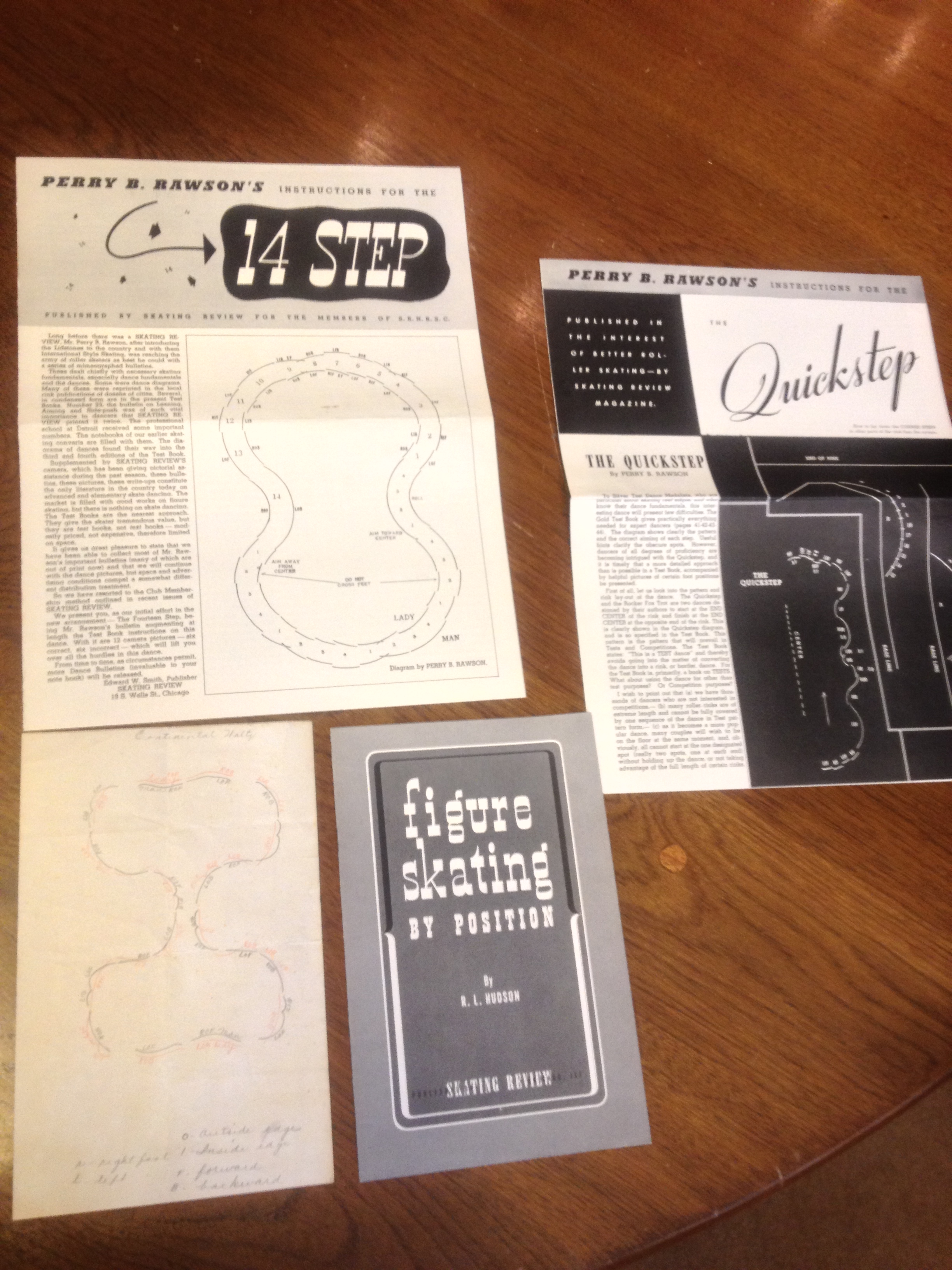
… to a collection of items on roller skating …

roller skating… and a sammelband bringing together six very scarce short works published in Ireland in the nineteenth century. They’re mostly religious in nature, but included among them is an 1817 report published by the Belfast Saving Bank, which includes stories of exemplary savers who took advantage of the banks services:

2013-08-23 11.11.282013-08-23 11.12.21


Lazy Like a Fox

Here’s an item that’s probably best described as a “multimedia” production:Deed


In this deed Henrietta Hawkins grants ownership of some Brookhaven, NY real estate to Hannah Barleau. Ephemeral “job printing” such as forms like this one were the bread and butter of many publishers, and Avery Herrick presumably printed many copies of this standard deed. The document itself is cleverly-designed to fit any situation (printing “ha” so that the document can accommodate the singular “has” and the plural “have,” for instance), and mixes printing and manuscript modifications.

But this case takes that familiar situation to another level: not just printing and manuscript, but also recycled news print. Why go to all the trouble of writing out a description of the property, Henrietta must have thought, when I can just paste in the one I already had printed in the newspaper?

This item can be found in a scrapbook in our Nicholson Whaling Collection (Subgroup 25, Scrapbook 1).

The Printer’s Working Library

Here at PPL we have a fantastic collection of books on the history of printing and typography, and that collection was originally founded as a resource for working printers in the area, providing a library of books they could use to improve their own work. The collection includes thousands items–books, manuscripts, pieces of ephemera– especially type specimen books.

I was curious what the working library of a modern printer might include, and Dan Wood of DWRI Letterpress was kind enough to let me stop by and take a look at the library in his print shop. Here are some photos of what I found:

There’s art all over the place in a print shop. Especially masterpieces by the printer’s kids.
Type specimen books are still in use for a lot of purposes: showing customers options for faces, picking a typeface to match something printed by photopolymer plate, etc., etc.
The biggest surprise: How essential a good etiquette guide is to the modern letterpress printer. Why? Because…
… they include example text for things like wedding invitations that are frequently printed by letterpress.
I also found some titles we were lacking, like the Vandercook 100 (DWRI Letterpress is among the print shops featured). We now have a copy in the collection.


Blog at WordPress.com.

Up ↑